
Reviewing Marko Denic's Newsletter Landing Page
Hello friend,
This is the first post of a new series where I write about the apps I get inspiration from.
Since I started building my own apps, I met experienced people that have been building their own apps for years, if not tens of years.
I believe learning can be done through tutorials and books, but it can also be done by stealing ideas and best practices.
So with this new series, I’m trying to document what I find interesting and helpful in the apps that my friends and other indie makers built.
Let’s get it started!
TL;DR
Some lessons learned while checking out Marko’s newsletter page:
- title and subtitle should be reader focused: specify what’s the benefit of subscribing to the newsletter
- adding an avatar list with some people that are subscribed offer credibility
- there should be clear separation between the sections: either by using a different background image or effect
- add dark and light theme toggle button to increase readability
Say “Hi 👋” to Marko Denic
I first met Marko about 2 months ago. We had a coffee chat, and I can say he’s so humble and friendly. Thank you so much, buddy, for all your great pieces of advice! 🙏
Marko runs a successful newsletter, where he shares web development tips and resources.
Since I’m also running a newsletter (the one that you’re reading right now), I thought I could check his landing page to learn from it and see how I can improve mine!
Check out his landing page, and definitely subscribe to his newsletter: https://markodenic.tech
Analysing the top section
There are some subtle details that I really like.
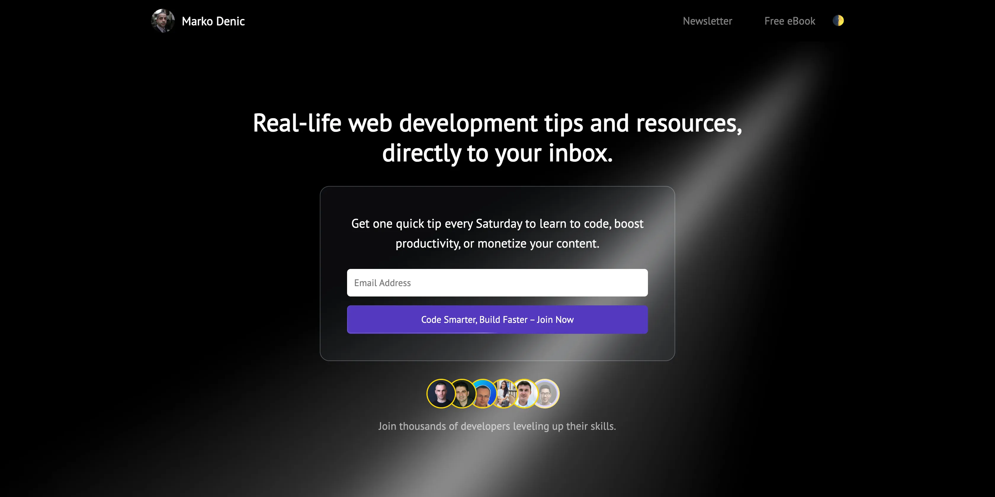
At one glimpse of an eye you know exactly what you’re getting if you subscribe: “Real-life web development tips and resources”.
The subtitle also let you know the frequency of the emails, and the benefits of reading his posts.
Compared to his top section, mine has too many words, and says almost nothing. It’s centered around me, not focused on the readers’ needs.

One element that’s missing on my page is an avatar list. This is the first thing I noticed when I opened Marko’s page. That’s a great feature that offers credibility and encourages users to subscribe.
Also, based on the design Marko uses, if you have more sections on your page, adding a background image or effect is a great way to separate each area. This can work well to separate, for example, the hero section and the rest of the page.
Analysing the overall page
I think the toggle between the dark and light theme is a a great feature. My page has a white background by default, and it can be disturbing if you check the page during the night.
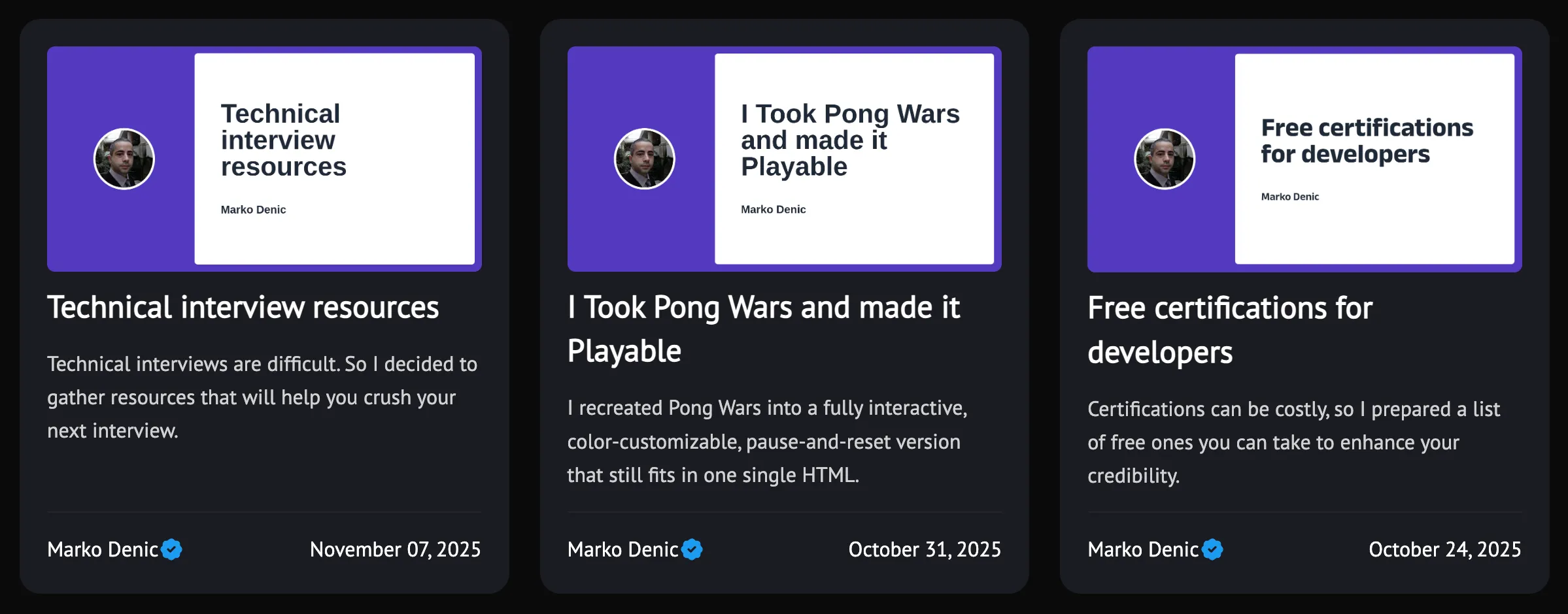
Also, the page is more alive because of multiple animations on several elements. For example, adding hover effects to buttons, cards and borders can really improve the user experience.
He has a comprehensive list of meta tags and SEO properties. I definitely have to check all of them out and make sure I use them as well.
On the home page, another thing I noticed is that on each card his name and avatar are visible. This might be a nice visual addition. Even though you might be the only one writing the posts, it’s not a bad thing to remind people who wrote the article.
The name and some additional info can be added to the posts page as well, for the same reason.
Some subtle improvements
I think Marko’s page looks great. It’s right on point, and you know immediately what he is doing and why you should subscribe to his newsletter.
There are 2 small things I would improve.
- Adding the link to the whole card, not only on title and image. From a user perspective, if the card has an animation on hover, they expect to be able to click on the card, not on a separate element from the card.
- The responsiveness of the cards can be improved for tablet size, or smaller laptop screens. This is an issue I have on my page as well (my page is way worse 🫣).
In conclusion
Thank you for reading my post. I hope you got some ideas from my post on how you can improve your portfolio or newsletter landing page.
Thank you, Marko, for all your great work, and for all the useful resources you prepare for the tech community!
If you like this post and you want to keep the discussion going, these are a few places where you can find me:
👉 I’m most active on X/Twitter: x.com/razvanmuntian
👉 Checkout my LinkedIn account as well: linkedin.com/in/razvanmuntian
👉 My personal website: razvanmuntian.com
👉 Tech Terms Explained Simply: techterms.io
Thank you so much for reading this post and I hope it’s been inspirational!
See you soon!
